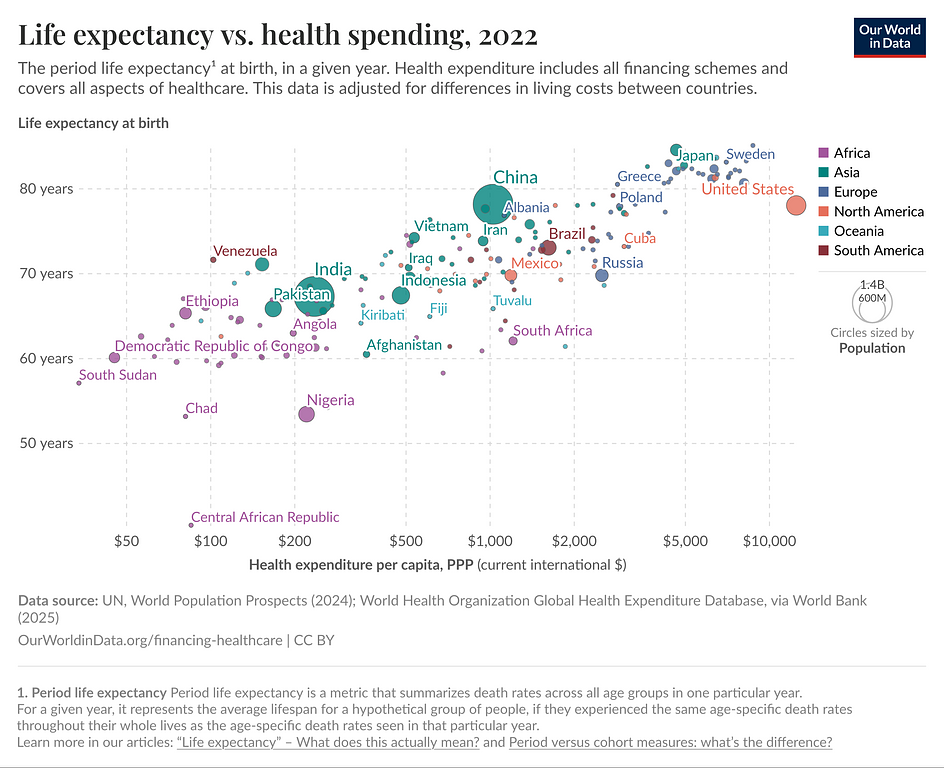
Today, I came across this interesting chart from Our World in Data. It shows a bunch of countries, plotting them on two axes: "Life expectancy at birth" and "Health expenditure per capita":
A graph showing various countries, comparing life expectancy vs. health spending
In general, the more a country spends on health, the higher the life expectancy. There are some notable outliers, though. I want to highlight one: Spain and Italy spend about the third of what the US does on healthcare, but their life expectancy is significantly higher (~ 4 years higher). There are some other countries in that cluster, too. For example Japan and New Zealand, who are very "efficient" in that way.
Clearly, other factors outside of spending money on health care have an impact on life expectancy. Most likely what kind of food you eat and physical fitness. What else?